Chegg
2019-2020: Product design • UX • UI • Prototyping • User testing
Chegg is a publicly traded EdTech company that provides services and software products to college students. Their team based in New York works on their citations and writing products. These products allow students to automatically create citations and check their papers for grammar and plagiarism.

Chegg writing website
Product images


• • •
Overview
Role: Product design lead
Team: 1 product manager, 1 UX researcher, 3 engineers
Challenge: Combine two existing products to help reach 52% year-over-year subscription growth
Process: Advocating to increase scope for a centralized dashboard and completing full design and research process
The Outcome: 52% year-over-year subscription growth for 2020
Introduction
I was contracted by Chegg to work on their writing and citations products. Specifically, the most significant project I worked on was figuring out a way to combine these products into one unified experience. I completed the full UX and UI for this project in collaboration with other designers where their respective projects intersected. The UI of my designs was completed according to an existing design system. My design decisions were influenced by research and user testing completed by an in-house UX researcher. This case study covers my full process in completing this project, highlighting the steps I consider to be the most interesting or challenging.
• • •
The problem
Due to its structure as a company, Chegg faces a lot of UX challenges. The company started as an online book rental service but has found a way to grow dramatically through the acquisition of smaller EdTech businesses. Chegg now exists as a conglomerate of many business units covering almost every academic need of college students.
With each acquisition, however, Chegg must roll that company into its existing offerings, which requires significant UX work. It raises a lot of questions around how new products should live in the existing ecosystem to reach the company’s revenue goals. For example, which products should go under which subscriptions? How can new features be surfaced to current subscribers? How can independently created products be combined to provide a seamless user experience?
These were some of the questions we were considering for EasyBib, a citation generator tool and Chegg Writing, a grammar and plagiarism checker for papers. Both products came from acquisitions, and we were tasked with combining them into one unified product (now just called EasyBib) with a clear value proposition for subscribers.
• • •
Business considerations
The product strategy team set a goal to increase year-over-year subscriptions by 52% by the end of 2020. This was difficult because as it currently stood, most of the revenue from the site came from advertisements. Ads made up over 70% of total revenue, while subscriptions made up less than 30%. The reason they needed to focus on subscriptions at this point was because the real estate for ads had been essentially tapped out. The highest potential for growth at this point was in subscriptions because ads revenue was close to its maximum capacity. But the choice to focus on ads had put us in a difficult position because it created a poor user experience, and good user experience is required to attract subscribers.
Image of EasyBib homepage showing the amount of screen real estate devoted to ads.
• • •
The current state of affairs
When I arrived at Chegg, the citations and writing products were actually combined, but very haphazardly. Though they were part of the same subscription, they lived on separate sites. The user had to click through the citations site to get to the writing site, and the writing site had no link to citations. There was no central navigation.
The old citations projects page with a link to the writing product.
Initially, this project was envisioned as essentially a reskin of this page. However, I did not think that UI changes would not get us to our goal of increasing subscriptions by 52%. I felt that we needed to rearchitect the entire product, which I advocated for.
• • •
Rethinking the assignment
My argument for rearchitecting the product centered on creating a better user experience that encompassed 2 main points:
Reduce the invasiveness of ads so free users actually like the site and can use it easily, making them more likely to subscribe.
Create a centralized dashboard for a more holistic and valuable experience worth the subscription price.
• • •
Reducing ads
I felt that we had to reduce the ads in some way to attract more subscribers.
Because of ads, the current site was slow, the images and videos were distracting, and unnecessary steps were added to the citation process to increase opportunities for ad placements.
Previous user research indicated that users saw the site as transactional. Users told us that wanted to create their citations as quickly as possible and leave. And since the ads were so distracting, a kind of tunnel vision was created where users struggled to pay attention to anything other than what was needed to complete a citation, so much so, they didn’t even notice upsells to subscribe. The NPS (Net Promoter Score) was a very low 25, and users who do not even want to be on your site do not want to subscribe.
Based on the research, if we wanted to increase subscriptions, we needed to reconsider the ads. Otherwise, it was unlikely users would see the site as something worth subscribing to.
Ads were such a major part of the revenue that there was no way they’d never exists, but I did think there could be a way to make them less invasive. I drew up a prototype to present a rethink on how the citations experience could be more seamless with the ads having less presence on the page.
• • •
Creating a centralized dashboard
The other way I felt like we’d attract more subscribers was by creating a more holistic and valuable user experience with a dashboard.
The product strategy team had created a list of thematic goals they believed would get us to a 52% increase in subscriptions which were:
Strengthen the core product
Expand audience
Activate existing users
Expand the value of paid product
I used those goals to convey my argument for getting a more thorough redesign approved. I presented a deck to the company with the UX changes across the product I thought were ideal, but the main idea of the redesign was a centralized dashboard to combine the citations and writing products. Below is a summary of my arguments:
1. Strengthen the core product
Paying for one subscription with access to tools on multiple sites is confusing and unreasonable. We can strengthen the core product by creating a centralized place for all of the subscription’s features.
2. Expand audience
Currently, users have low awareness of the full value of the subscription. Specifically, they don’t know about the writing product. Over 90% of citations users had never uploaded a paper to the writing site and only 23% of citations users were aware that there was a writing product.
The way to expand our subscription audience is to make them aware of the full value of the product, specifically the writing product. A centralized dashboard with all of the subscription’s functions in one place will easily aid in awareness.
3. Activate existing users
A dashboard would allow us to make conversion a priority using empty states and gated access.
4. Expand the value of paid product
The current user experience isn’t strong enough for the price tag. For $9.99/month with college students as the target audience, the UX needs to be high quality.
Additionally, if Chegg wants to continue adding features (which historically speaking they were likely to do), we need a place for users to access everything. The current architecture can’t sustain the addition of new features. A dashboard would allow us to keep adding features easily.
My full deck is below:
• • •
Designing a dashboard
After presenting this deck, I got the go-ahead to increase the scope of the project to create a dashboard and rework the navigation. The issue of rethinking the ads experience was assigned to a different team. The rest of this casestudy will focus on the design and testing for the dashboard.
Before diving into designing, I set the following principles for our dashboard so it would be aligned with the goals I established above:
1. Flexible
New features should be able to be easily tested and added.
The features should be able to have varying prominence depending on usage.
2. Iterative
Because we don’t know how much access we’ll have to engineering resources, we want the dashboard to be able to be executed iteratively. We can architect it now but execute it in stages.
We can use widgets and other features that already exist as we build to the final design.
3. Optimized
We want to make conversion a priority and architect it into the design.
We will use empty states and gated access to encourage users to upgrade.
• • •
First iteration
I started by flows to show how the user would get from different parts of the product through the dashboard:
A user flow I created showing how the dashboard fit into the flow of a guest user creating a citation and uploading a paper.
I then worked with another designer to make sure all of the parts of the product fit together. We collaborated on the following flow diagram of the full product:
A user flow diagram I collaborated on with another designer.
After the flows were defined, I began working through wireframes to figure out a direction for the dashboard. The features of the first iteration were a:
1. Left-hand navigation
This is common to most dashboards, and since one of our main goals was to surface functionality, I thought a left-hand navigation would be the most visible.
2. Focus on returning users
At this stage, we believed that users who would most often see the dashboard and get the most use out of it were returning, so previously created citation lists and papers took up most of the real estate for these users to easily access them.
3. Vertical layout
As we added new features and functionality, they would stack vertically, and we could assess which ones were used most and place them towards the top.
Below are iterations of this design:
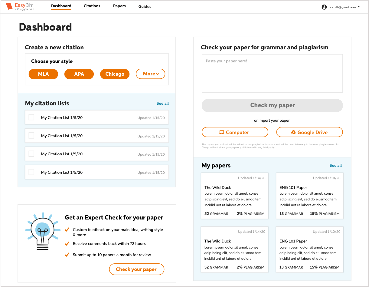
Early wireframe of version 1 of the dashboard.
Early design of version 1 of the dashboard.
Below is a link to the presentation for the first design review of my dashboard design and another designer’s new citations design:
• • •
Changing directions
I started on the second iteration after receiving feedback from our design review. One of the main concerns from the VP of product was that the paper uploader wasn’t prominent enough. Despite the citations product having far higher usage (which was the reason I made the citation uploader most prominent) our VP of product was clear that uploading a paper was the most important action we wanted users to take. She felt that this would be the best way to encourage use of the writing product, and therefore, subscriptions.
With this feedback, I wanted to make the design more modular with the main focus on the widgets and surfacing all of the functionalities of the product. The second iteration featured a:
1. Top navigation
After our first design review, we found out that the free citations product would not be redesigned in the near future, and it was difficult to make the left-hand navigation work with the current design. In addition, another Chegg dashboard used a top navigation, and adding one to ours would be more visually consistent. Though I still thought a left-hand navigation was more appropriate and visible, I decided this was a good compromise.
2. Focus on surfacing functionality
The focus of this iteration was to make users aware of all parts of the product. The citation and upload widgets would take up the most prominent real estate. Secondary focus would be on upselling and returning to previous work.
3. Modular layout
As we added new features and functionality, they could stack like puzzle pieces. This design would have more flexibility than the vertical layout because features, upsells, and ads could be different sizes and placed throughout the dashboard.
Below are early iterations of this design:
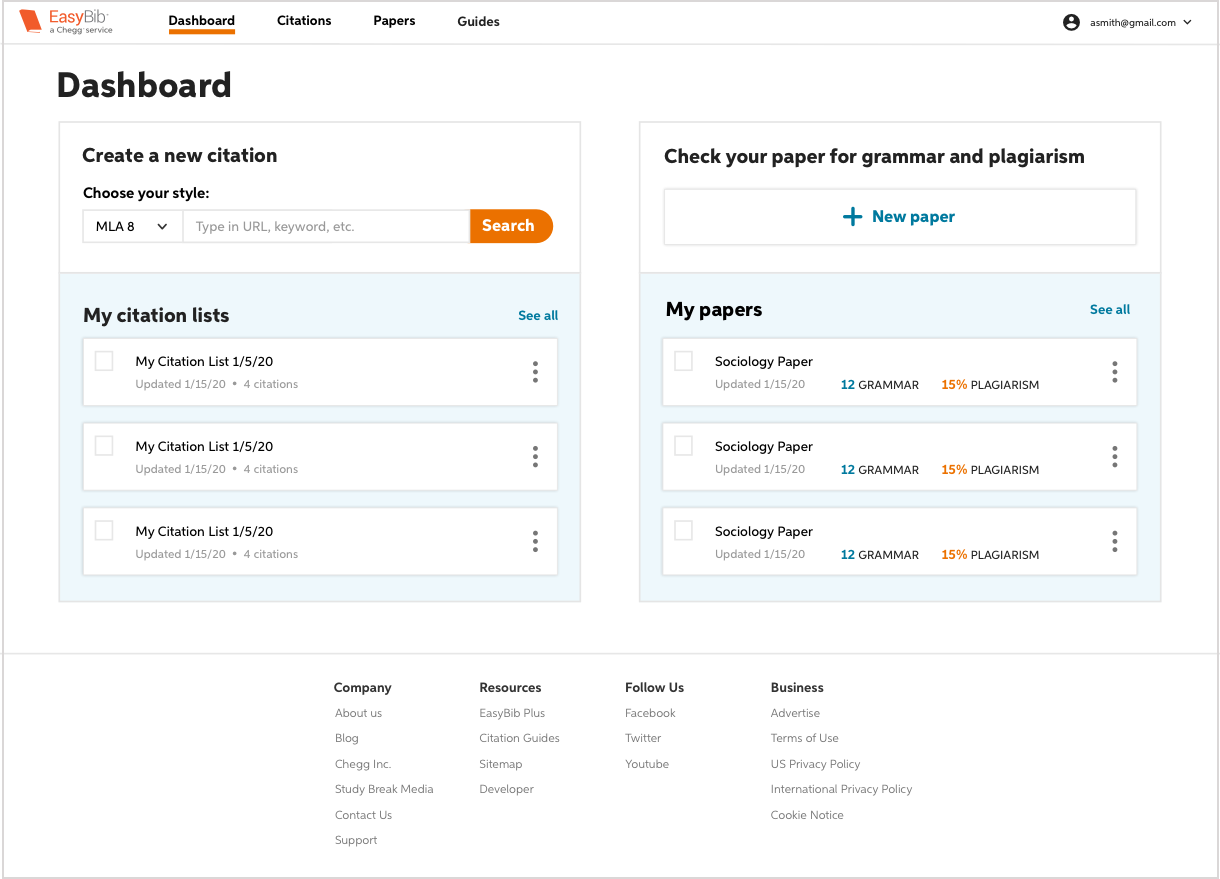
Early wireframe of version 2 of the dashboard.
Early design of version 2 of the dashboard.
Once it was clear that this was the best direction to go in, I began iterating on the UI, considering feedback from product managers, content strategists, and other designers. Below are some of the UI iterations I made in getting to the final design:


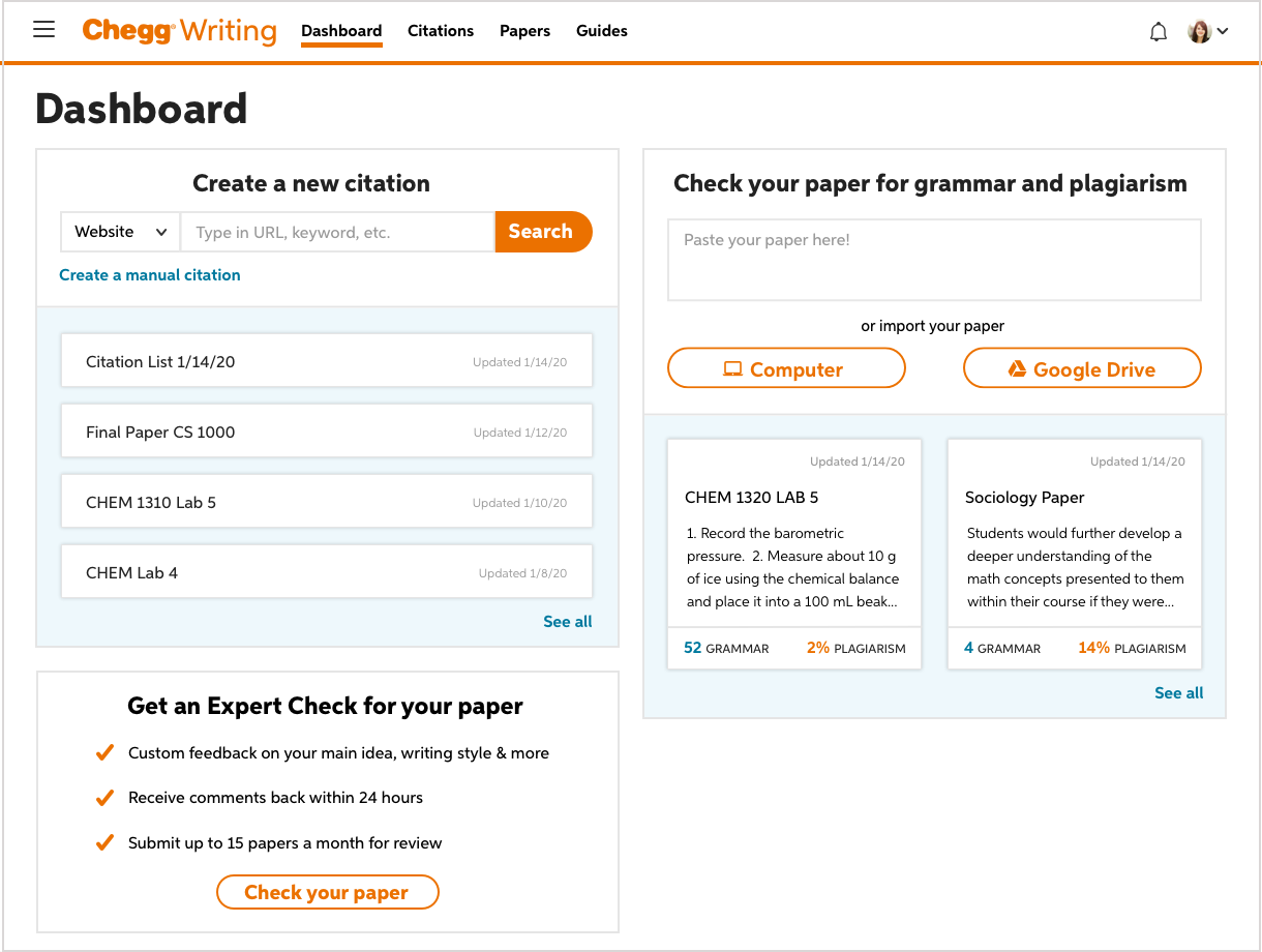

Below is the final design of the dashboard:
The final design of the dashboard after user testing was completed.
In my final design review, we presented three different versions requiring different degrees of engineering lift (a low, medium, and high) to show how we could build to our ideal design in stages depending on our access to resources.
I also presented possibilities for ways that upsells and ads could be employed in the design.
Possible upsell placements on the dashboard for a guest user.
Possible upsell placements on the citations page for a guest user.
• • •
User testing
After the design review, we were allocated engineering resources to start with the medium lift version of the dashboard. I worked with our UX researcher to come up with a list of questions we wanted to explore and conduct user testing on both versions of the dashboard (the medium and the high version). Below are the questions we were considering and the conclusions from the testing:
1. Did users understand the term ‘Dashboard’? Did it represent what they were seeing?
Users did understand this term and it made sense to them to call the page this. There was discussion about whether or not we should call this page something ‘friendlier’ like ‘My Stuff’ but nothing quite clearly represented the page as ‘Dashboard’.
2. Were users able to use the ‘slimmed-down’ citation widget? Did they miss the dropdown?
The previous widget design with the 4 large buttons had existed on the citation site for a long time. There was research that showed that having the most common source types as buttons reduced error. When users had more choices from a dropdown, they were more likely to choose the incorrect source type or miss the dropdown entirely. However, with the current design, this was not the case. Users were able to correctly use the ‘slimmed down’ widget as easily as the old one, so we went with the more ideal design.
3. Did they understand the concept of the previous papers and citation lists?
Users did understand this, but having the label ‘My papers’ and ‘My citation lists’ helped.
4. Did users understand the ‘slimmed down’ paper widget?
Not really. It didn’t make sense to them why the widget would be condensed. Further, the ‘slimmed down’ widget placed more emphasis on uploading the paper versus copying and pasting it, and we wanted equal weight placed on both options.
5. Could users navigate easily with the top navigation? Did the navigational elements make sense to them?
Users were able to spot the top navigation and get between the pages easily. They understood by the labels the pages they were being taken to.
Below are the versions we tested:
The medium version of the dashboard.
The high version of the dashboard.
• • •
Conclusions
At the end of 2020, Chegg reported that they had met their goal of increasing year-over-year subscription growth to 52%.
Overall, I believe that we ended up with a design that was able to balance the business needs of increasing subscriptions with best serving the user. Using a modular dashboard was the main fixture of this solution, giving us an underlying architecture that could support adding and testing features, including upsells, and emphasizing/deemphasizing different tools.
User testing further encouraged our focus on the user experience itself, helping us decipher parts of the design that were purely aesthetic choices that reduced ease of use.