Amplify
2018-2019: Product design • UX • UI • Prototyping • User testing
Amplify is an EdTech company that creates digital curriculum programs for elementary and middle school students across the country. Their product covers both language arts and science and includes grading and reporting tools for teachers.

Amplify website.
Product images


• • •
Introduction
I was contracted by Amplify to make UX/UI updates to their eReader, library, and curriculum application. My work involved translating user feedback into better UX solutions, applying a new style guide to elevate the look and feel of the interface, and conducting user testing with students. This case study covers what I consider to be the most difficult or interesting challenges of this project and the decisions I made that I feel had the greatest impact.
• • •
A better reading experience
The eReader at Amplify was considered a centerpiece of Amplify’s product. It was used for every book in Amplify’s library and existed in every part of the curriculum application that required students to read text. However, the current design didn’t support this perspective. The current eReader’s margins were often too narrow, there were usability issues, and functions standard across other eReaders weren’t supported.
We started by adjusting the margins of the eReader to give it more real estate in the curriculum application. Since we wouldn’t be starting from scratch, I worked with the current build of the product and made size specifications to existing divs and containers. This change made the text more central to the experience of using the application.
Original eReader in curriculum application.
Margin adjustments for eReader.
Redesign of eReader in curriculum application.
I also altered the margins in the eReader in Amplify’s library. The line length was significantly longer than what’s considered optimal for readability, so we widened the margins to accommodate a 70 character line length. This change made the eReader more in line with standard practices for digital reading experiences.
Original eReader in library.
Margin adjustments for eReader.
Redesigned eReader with optimal line length.
In addition, the library eReader was shifted to the left side of the page to give more space and focus to notes added by the user. However, the more common use case was that users would not have notes on every page. It didn’t make sense to shift the text for the entire reading experience to accommodate notes that didn’t exist in most cases. We placed the text in the center of the page with a design that made the notes secondary to the text.
Original eReader note.
Redesigned eReader with note.
• • •
Getting competitive
Amplify’s eReader was about 4 years old, and since it had not been updated in that time, it didn’t have features consistent across other eReaders on the market. To consider what features we could add to correct this, I completed a competitive analysis:
Deck I created for a competitive analysis.
Most eReaders had a clear measure of progress within a book. Amplify’s eReader had an algorithm that calculated the amount of time read, but it didn’t indicate the user’s actual location in the book. We added a visual progress bar that showed the user’s location in the book that also worked as a navigation tool.


We also added settings features that were common in other eReaders, such as the ability to change the line spacing and more font size options.
Original eReader settings.
Redesigned eReader settings.
The table of contents for books had an uncommon horizontal pattern that wasn’t ideal for long chapter titles. We changed this to the more common pattern of a vertical dropdown.
Original table of contents.
Redesigned table of contents.
• • •
Considering usability
There were a number of usability issues with Amplify’s eReader. For example, the original audio player partially obscured the text while the audio was playing. I created a design where the audio player was pinned to the top of the eReader so that the user could read the full text while listening to the audio.
Original audio design covering text.
Redesigned audio feature is pinned to the top of the page so no text is obscured.
Another usability problem was the filters in Amplify’s annotations dropdown. The filters for showing bookmarks, notes, and highlights were buttons that were automatically turned on. When the user wanted to exclude one of the options, she would need to click it to turn it off. This was disorienting because the more common use case for filters is that the user clicks on the items she wants to include. I changed the filters to a more familiar pattern of checkboxes, which the user would use to check which items to include.
Original annotations menu. User must select items to exclude.
Redesign of annotations menu. User uses checkboxes to choose items to include.
The most significant usability issue was with the process of adding annotations. The current process offered 3 different pathways for adding an annotation: highlighting, adding a note, and copying the text. However, the means of selecting the text was a highlight, which didn’t apply to 2 of the pathways (adding a note and copying). For example, if you were looking to copy the text, you couldn’t also highlight it, and that highlight wouldn’t remain after you’d clicked copy. Instead of a highlight, we made a more neutral selector tool to reduce confusion around the action the user intended to take.
Original text selector.
Redesigned text selector.
There were also issues around when a user chose to copy text. The publishers imposed limits on the number of characters that could be copied at any one time and of the total book. The original design displayed cryptic messaging stating the number of characters that could be copied “by action” and “by book”. However looking at the data, most students never got anywhere near the limits. Additionally, most testers couldn’t decipher what the messaging meant.
The process of copying too much text at one time was confusing as well. The text would turn grey for the characters that were beyond the limit, but there was no messaging to communicate to the user what that meant. In addition, when the user clicked copy after selecting text past the limit, there was no feedback to let him know that not all the text was copied. The user was to left to find that part of what he intended to copy was missing. Even if the user successfully copied the all text he selected, there was still wasn’t feedback messaging.
GIF showing the original process of copying too much text.
We refined this process by removing the cryptic messaging and adding clear user feedback. When a user successfully copied her selected text, she received a success message. When the user selected too much text to copy, this was made clear with simple messaging and color coordination with the characters that were beyond the copy limit.
Text successfully copied messaging.
Text not copied messaging.
Our user testing of this flow showed that middle schoolers could interpret this messaging and understood when the text was copied successfully and when it was not. A full prototype of the annotations process that we used for user testing can be found here.
• • •
A better learning experience
The second project I worked on at Amplify was making lean but significant UX and UI changes to the curriculum application. The design of the curriculum application had not been updated in a number of years and Amplify was looking to make changes based on consistent feedback they received about usability problems. The following are the three main issues we were looking to solve with the redesign:
The Hand In experience for students leaves room for error. Students often do not see the Hand In button, so do not properly submit without a teacher’s reminder, and they do not have a clear way to notice if they skipped a question. Additionally, they are not given any sense of finality when submitting - for example, a post submit ‘lock’.
The experience navigating through large cardstacks is time consuming and clunky. Reviewers may want to jump around between questions, and students do not have a sense of progress as they work through large cardstacks.
The space on the page is not well utilized and feels inconsistent and not well structured. Many fonts and colors are inaccessible.
The major constraint was that the underlying architecture of the application couldn’t be changed. The goal of this project was to make quick, lean UX improvements, so all of the changes would need to work with the existing structure.
• • •
In flow
For every group of activities in the curriculum application, students were required to hand in their work. However, the original design had the hand in button that students used to submit their work to their teacher at the top of the page. When students scrolled to complete the activities on the page, the hand in button would no longer appear. They would need to scroll back up the page to hand in their work.
Original hand in process. Users must scroll up to hand in their work.
Teacher feedback was fairly consistent that the placement of the button was frustrating. Students had to be reminded constantly to hand in their work, and they still often forgot.
The other issue was navigating between activities. Students had to use the tabs at the top of the page to go to the next activity. However, there was nothing guiding them to where to go next. There was no clear messaging about what to do when they completed the work. Teacher feedback on this issue was consistent that it often took a long time to get their entire class on the same page. Navigating between activities using the tabs left a lot of room error.
Original process of navigating between activities. There is no messaging indicating what the user should do next.
My goal was to create a design that had continuous flow for all the actions a student needed to take. I felt that a design that provided a clear structure for moving through the lesson would prevent navigation errors and save teachers time. I also wanted to make the buttons for these actions consistently present so that the user didn’t need to go looking for them.
I did some sketching of different ways this design could work and landed on the idea of having a persistent bar on the bottom of the page. Since having multiple buttons in this space seemed heavy and confusing, I wanted to figure out a way to have one button that would always take the user to the next place he needed to go.
I decided that one button on the bottom right would stay in the same place and have multiple functions. When the user needed to go between cards in an activity, the button would say ‘Next’ and take him to the next card; when the user needed to hand in work, the button would say ‘Hand In’ and allow them to submit work; and when the user needed to go to the next activity, the button would say ‘Next Activity’, and take them to the following activity in the lesson.


We also folded the update process into this system. We kept the current functionality of having the update button activate after the user made changes, but we used the same persistent button to make the update process part of the same continuous flow.
GIF showing original update process. Update button activates after user has made a change.
We made improvements to the update process by providing clearer messaging to users once their work had been handed in and updated. The green color was more in line with current patterns for successful actions and the language and other ui updates offered a stronger sense of finality when submitting work.
GIF of redesigned update process showing update button as part of lesson flow. Clear messaging follows a successful submission.
• • •
Finding your way
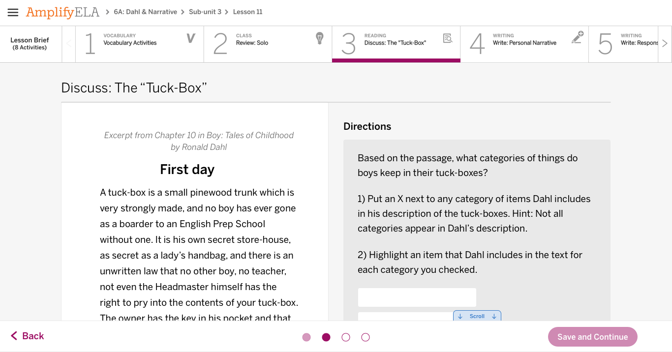
Another issue that teachers were consistently frustrated with was navigating between cards in activities. Some activities had up to 27 cards, and the only way to navigate between them was to click the ‘Next’ button, which only took the user to the very next card. There was no way to jump around between cards.
Original design showing the difficulty in navigating between cards.
Additionally, there was no way to see progress on cards. Users could skip cards with the intention of going back to answer a question, but there was no visual representation of this. I felt that the most elegant design solution would handle both the issue of navigation and progress with the same design elements.
After working through some different ways this could be represented, we landed on buttons on the bottom that acted both as a way to get to the cards and showed progress. When refining the UI, we considered a number of different factors. We didn’t want the buttons to be too present, since we didn’t want to encourage kids to skip cards. We also didn’t want too many numbers present when the activity had a lot of cards, since it could become overwhelming. However, we still wanted to give users a clear sense of how many cards were in the activity. Below are iterations of the ui:


Early iterations of card numbering.
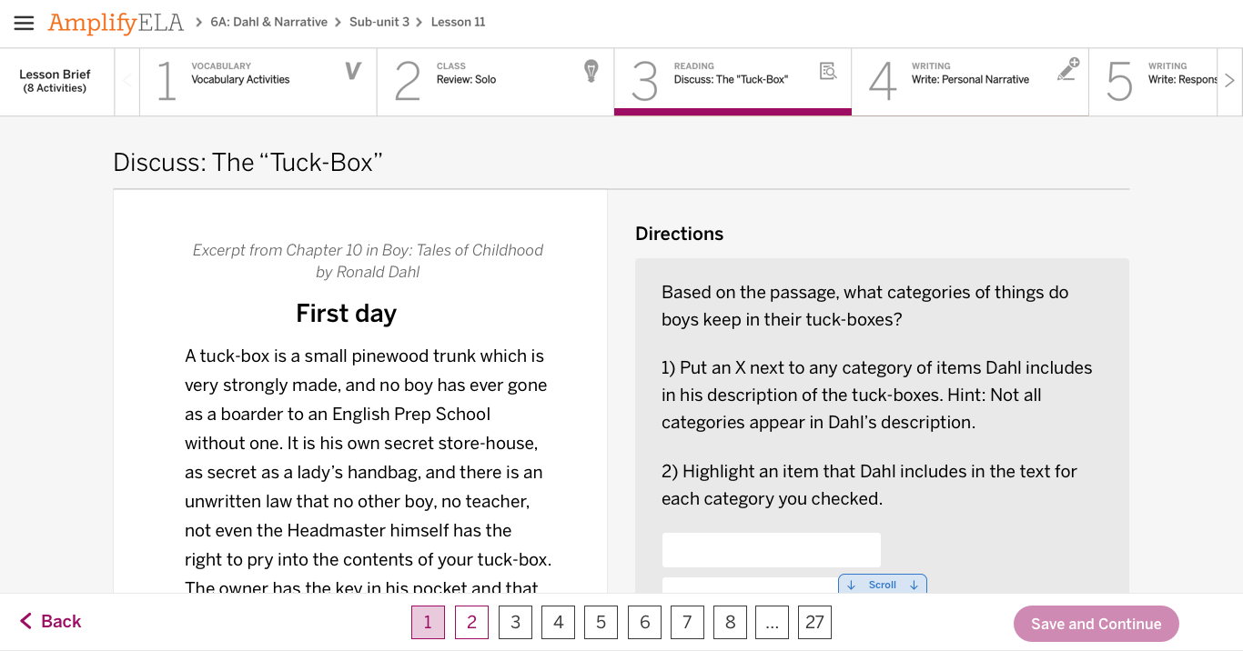
We landed on small blue and grey buttons that had the number of the card they represented. When a user completed the work on the card and navigated away, the number for that card would turn blue. The numbers for uncompleted cards would remain grey. The grey numbers were intended to give students a visual representation of anything they skipped and encourage them to go back.
Redesign of card numbers showing progress and navigation functionalities.
For activities that had many cards, we decided to limit each set to six and have arrows that to click through to the other sets.
Redesign showing the ability to navigate between many cards.
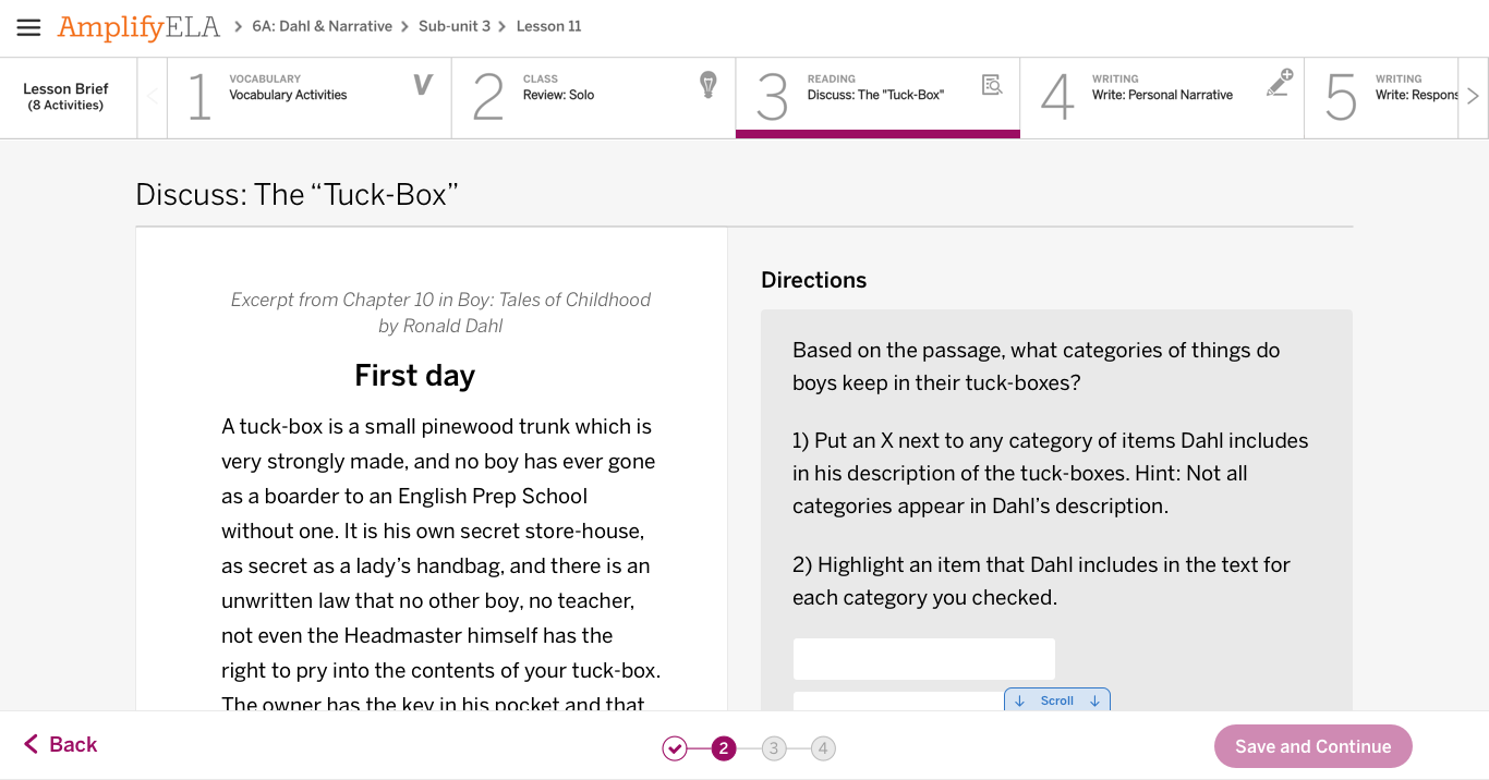
We also introduced a modal that notified users if they had skipped any questions before they were able to hand in their work.
Modal notifying users of missed questions.
User testing of these functions showed that middle school students understood how to navigate between both the cards and activities and how to update their work. In most cases, they favored the new navigational elements, such as the right hand button and card numbers over the old navigational elements. The full prototype we used for user testing can be found here.
• • •
Tidying up
The final issues of the redesign revolved around making changes to the display of the content to make it more accessible and improve hierarchical issues. Unfortunately, the scope of our project required us to work within the constraints of how the content was already laid out, since we weren’t able to make any changes to how it was originally authored. However, I was able to apply Amplify’s new style guide and make changes to sizing, which made a significant difference in the look and feel of the product.
I used grey and white more deliberately to draw the user’s eye to the most important part of the page. The eReader was made white to make it the centerpiece of the activity. Text boxes and other places where the user was asked to do something were also made white. Lengthy directions and reference text were made grey to recede into the background.
Below are some before and after images of the redesign updates:
Original multiple choice question.
Redesign of multiple choice question.
Original data table.

Redesign of data table.
Original dropdown questions.
Redesign of dropdown questions.
Since there was no way to get all of the content above the fold and we heard from teachers that students often didn’t see all of the information on the page, I also introduced a ‘scroll for more’ indicator. This would appear until the user scrolled to the bottom of the page.
Redesign showing ‘scroll for more’ indicator at the bottom of the page.
• • •
Looking forward
User testing of both the eReader and curriculum application changes indicated that students were receptive to the changes. However, I don’t think we’ll know if we solved the major issues we were looking to change until the product redesign is being used in classrooms. I’d be excited to hear about how teachers feel about the changes once they are implemented.
I think the next step in improving the application would be to provide clearer constraints on how the content is authored to make sure it’s always laid out in a clear and cohesive way. I believe the best solution to this problem would be to overhaul the content authoring system in a way would accommodate the existing content but also establish design standards for new content. This way, content created in the future would written with a consideration for how it will actually be laid out.