
Literacy Pro
2017-2018: Product Design ∙ UX ∙ UI ∙ Prototyping
Literacy Pro is Scholastic’s flagship digital product that offers 1st through 6th graders the ability to read ebooks, take quizzes, set reading goals, and maintain a reading log. The product also has a teacher and school administrator component for viewing books and student data.
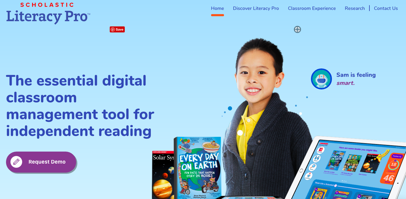
Literacy Pro marketing site.
Product images


∙ ∙ ∙
Introduction
I was hired as a UX/UI designer for the project by SOS Brooklyn, a design agency contracted by Scholastic. I started soon after the major functions and general style of the product had been established, so I worked with some style guidelines and wireframes that had already been created. In the course of this project, I created the majority of the design mockups and made significant architectural and usability decisions. This case study covers what I consider to be the most difficult or interesting challenges of this project and the decisions I made that I feel had the greatest impact.
∙ ∙ ∙
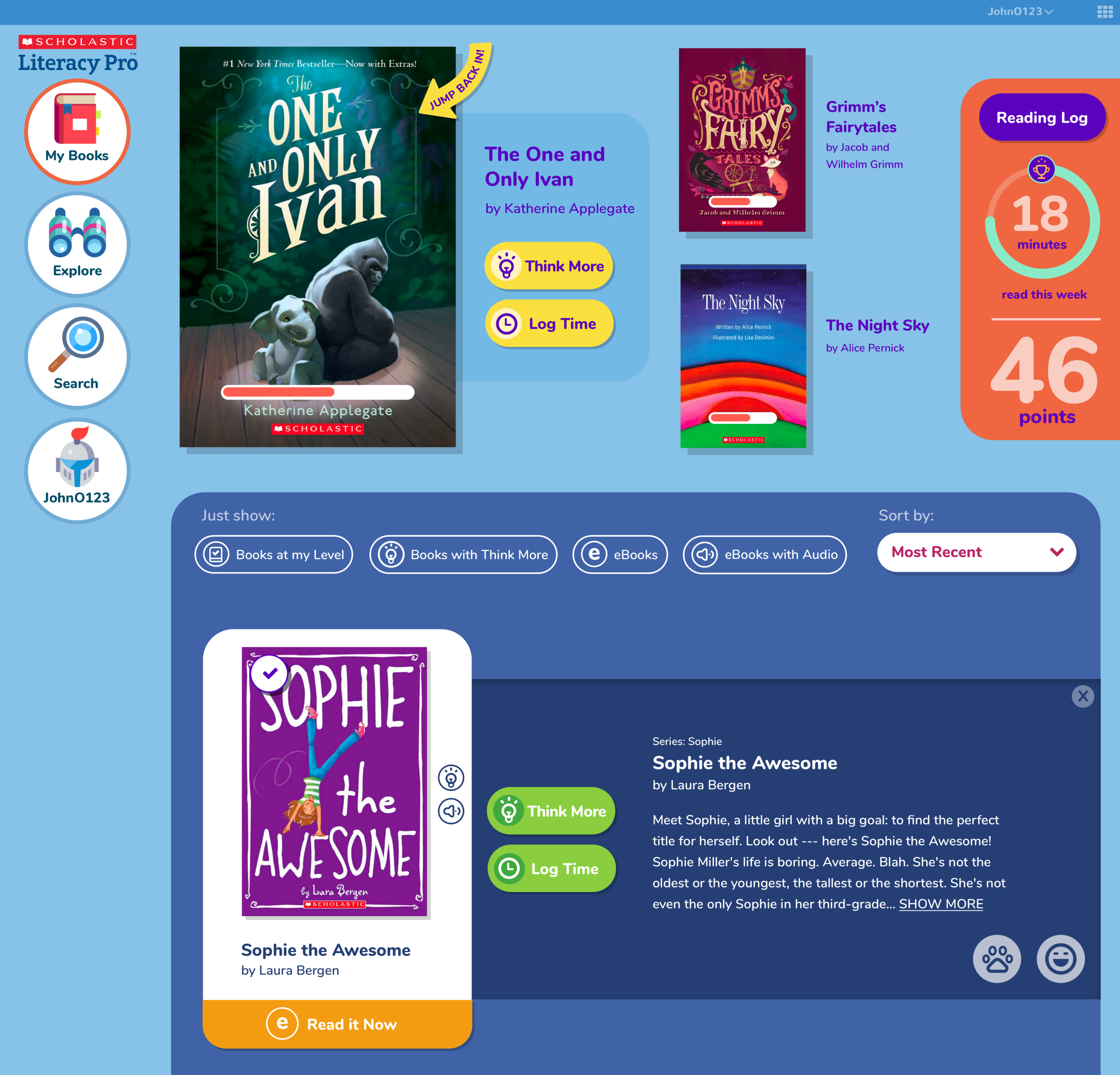
Read it now
After the initial dashboard was designed, we discovered with our clients that there was an issue with the display of ebooks. The ebooks weren't differentiated enough from the print books and the most common use case for the product was that students would be looking for ebooks they could read immediately.
The original design required the user to click on the book and open the interstitial before seeing the button that would send them to the ereader. In addition, the icon denoting ebooks was small, which required the user to look closely at each book to determine which were ebooks.
There was also a hierarchical issue with the ebook icon because it looked the same as the audio and quiz icons. Logistically speaking, the audio and quiz features could only exist if the book was an ebook. If the book was a print book, those features could not be available. However, the current design treated the ebook, audio, and quiz features as hierarchically equal, which falsely indicated that any book, print or ebook, could have any of these features. Below are images of the original dashboard created before I came onto the project:
Original dashboard. Quiz, audio, and ebook icons are all hierarchically equal. Ebooks are not visually distinct.
Original dashboard. Book interstitial must be opened before book can be read.
In order to make it easier for users to find and access ebooks, I knew that a new design needed to:
Differentiate ebooks from print books in an obvious way
Allow users to access ebooks in one click
Reflect the correct hierarchy of the ebook, audio, and quiz features
I decided early on that every ebook should have a large button that took the user directly to the ereader. I felt like the existence of this button could solve all of the major issues. It would allow the user to differentiate ebooks at a glance and access them in one click, and it would solve the hierarchical problem, as an ebook icon would no longer be needed. The button itself would act as the ebook icon, and it would be larger and more significant than the audio and quiz icons.
I created many iterations of what this could look like, trying to figure out the best spatial relationship between the button and book.
Iterations of the card layout with new 'Read it Now' button.
I ended up finding my way to a card layout, which allowed all of the elements of the book display (the author, title, icons) in addition to the button to feel more contained and clearly associated with the book. I also chose a bright orange color for the button that made it obvious which books were ebooks and deliberately drew users to those books.
Final search results page. Books are listed with a card layout, ebooks have distinct 'Read it Now' button, and audio and quiz icons reflect the correct hierarchy.
∙ ∙ ∙
Search filters
A major requirement of this product was that it had many filters for the book search. There were 4 filter categories with a total of 66 options. This was a huge number of options for a children's product, and I knew that it would be difficult to create a design system that accommodated this many filters but was still simple and easy to use. These were the main challenges I defined:
How can the categories be distinct?
How can the chosen filters be displayed? And how can they be easily removed?
How do the filters interact with each other? And how can this be displayed in an understandable way?
1. How can the categories be distinct?
The interest and genre categories were particularly similar in terms of the filter labels, and it needed to be clear which filters belonged to which category. In order to make the categories distinct, I created a tab system where each filter category occupied its own tab. I also assigned each tab a different color, which created further visual distinction.
Search filter categories distinguished by color.
2. How can the chosen filters be displayed? And how can they be easily removed?
I handled the problem of how to display selected filters by adding them to a space below the tabs. All selected filters would sit in this section, regardless of what tab was open, allowing the user to easily keep track of them as they searched for more.
I chose to represent the selected filters as separate tags so that they could be individually removed. That also allowed me to make them different colors so that they could be associated with the category they came from.
Search page showing selected filters.
3. How do the filters interact with each other? And how can this be displayed in an understandable way?
This was largely my biggest concern. I knew that with a list of filters this long, the choices could easily cancel each other out, leading to a search with no results and an incredibly frustrating experience. For example, what if a search for books at the 100 Lexile level, in the historical fiction genre, and less than 50 pages led you to no search results? You would have no way of knowing if that was because there were no historical fiction books at the 100 Lexile level, or no historical fiction books 50 pages or less, or any other combination of these filters. It would force you to test these options yourself, which would be a very poor user experience. Considering the number of filters this product provides, this example is a very simple search. A user who selected more filters could end up with an infeasible number of options to test. I determined that the way to solve this problem was to show how the filters affected each other.
I decided on a real-time display where filter selections would deactivate the other filters that would lead to no results. With this system, the user would never end up with no search results from filter selection. A lack of results could only come from a user-generated keyword search.
GIF showing search filter interactions and removal of selections.
∙ ∙ ∙
Reading log
Another major part of the product was the reading log, which would store all of a user’s data from previously read books (minutes read, date, rating, etc.). The most difficult challenge was how to handle print books. For all ebooks read, the data could be automatically recorded in the log, but for print books, the user needed to add the information manually. This created a need to handle multiple edge cases, including:
What if the book the user has read doesn’t exist in Scholastic’s system?
What if a user has been reading an ebook, but has then started reading the print version of that book?
What if a user needs to edit or delete minutes for print books? How are those minutes differentiated from ebook minutes (which cannot be changed)?
1. What if the book the user has read doesn’t exist in Scholastic’s system?
We determined that a user should always required to search or ‘quick add’ a book from their shelf first. We did not offer a way to add a book without first searching through Scholastic’s titles because we wanted to discourage users from randomly adding books they may not have read or adding books that may already exist in the system.
All search results would show an option at the end to add a new book if the user couldn’t find what they were looking for. This option was also available on a failed search page.

Reading log search process showing ability to add book at end of search results.
Once a user decided to add a new book they would have the option to add the title and author. The fields for these items were placed where that information would otherwise be in the log to maintain consistency.
The user would then be required to choose a generic cover for the book to visually represent the book in searches and the user’s bookshelf.

Process for adding a book not in Scholastic's system.
2. What if a user has been reading an ebook, but has then started reading the print version of that book?
An ‘Add Minutes’ button was added to the log drawer for every book. We determined that a student should always be able to manually add minutes to any book they’d been reading whether it was an ebook or not.
Reading log with 'Add Minutes' button for a book the user has read as an ebook and print book.
3. What if a user needs to edit or delete minutes for print books? How are those minutes differentiated from ebook minutes (which cannot be changed)?
I designed an edit function where print book minutes could be changed or deleted inline for each book log. Since the client determined that ebook minutes were not editable, these minutes needed to appear differently and clearly indicate that they could not be changed. I decided to represent this with the ebook icon where the edit button would otherwise be. A hover state let the user know that ebook minutes could not be edited.
Process for editing minutes for print books in the reading log. Ebooks have a hover state.
∙ ∙ ∙
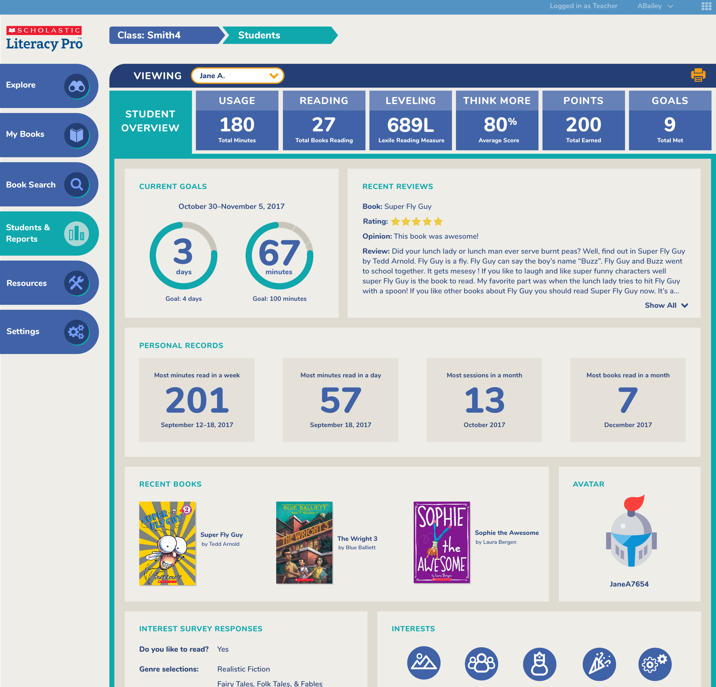
Reports organization
The client asked for an a very in depth set of statistics for the administrator/teacher side of this product. They offered the following list of required reports and a suggestion of the data it should show:
I decided that the best visual system to handle all of these reports would be one divided into broad categories. Categorization applied a clear visual hierarchy and would make it easier for the user to find the information they were looking for. Instead of searching for the reports separately, the user could navigate to a category and view all of the reports that fell under it at the same time. I organized the reports into 6 main categories and determined that tabs would be the most effective design system for users to go between them.

Tab system for teacher reports.
Another requirement of the reports was that users needed to have different levels of access. For example, an district administrator would have access to district data, school data, class data, and student data. A teacher would only have access to her own class and student data.
In order to accommodate the different levels of access and allow users to easily go between levels of data, we created a system where the user could essentially keep drilling down through the reports. The buttons next to the student names allowed the user to go to specific student reports and the arrows at the top served as markers for where the user was and a means of going back to the previous reports.
GIF showing process of navigating between class and student book reports.
∙ ∙ ∙
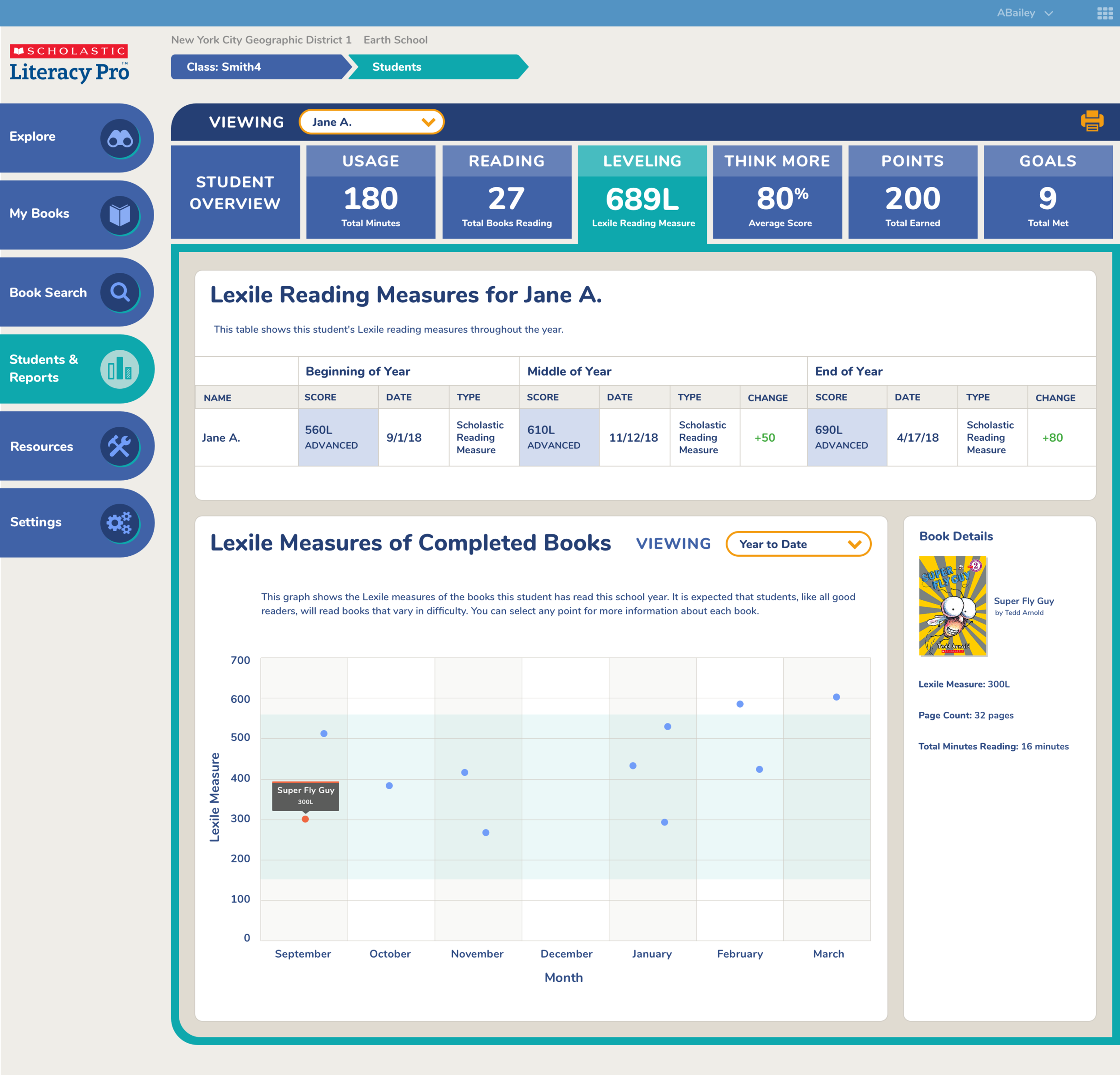
Reports data visualizations
Once I had defined the categories for the reports, I dug into how to represent the data. Since all of the reports measured different things, from Lexile level to number of books read, they all had to be dealt with separately to determine the best way to present the data.
Preliminary sketches for data visualizations.
Early wireframe of the reporting design system.
Below are some examples of the class and student reports to show the variety of data visualizations we created:


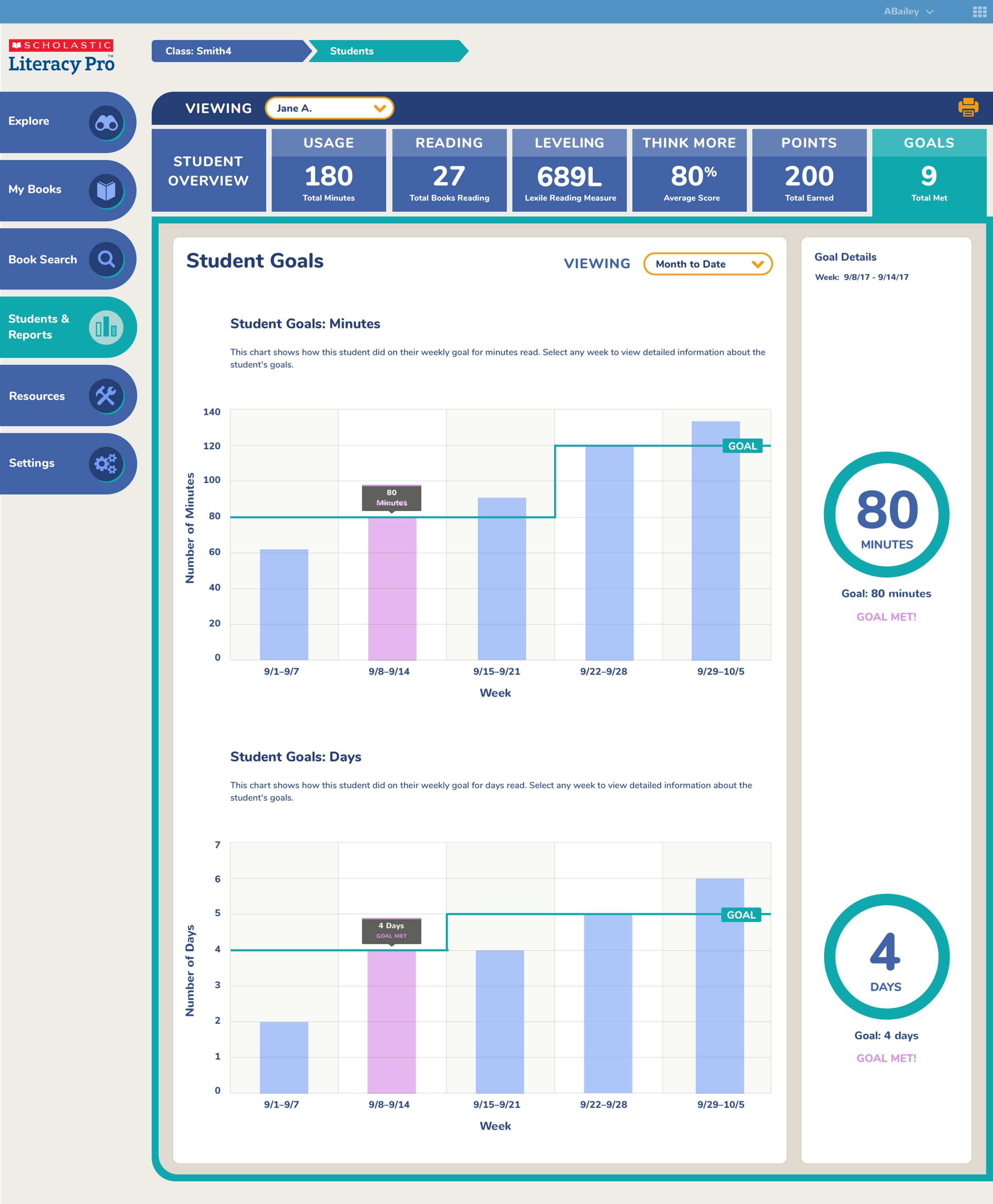


To create a consistent design system for all of these different data visualizations, I defined 3 main questions that each graph should answer:
How is the class performing overall?
How are students performing in comparison to each other?
How can a user target the students who are having trouble?
1. How is the class performing overall?
I decided that every report should first give the teacher an overview of the whole class, as she’d likely be interested in seeing her full class performance before drilling down into specific student data. I used scatterplots and bar graphs depending on the data set to give the clearest representation of class performance.
Example of scatterplot showing class data for usage of Literacy Pro.
Example of bar graph showing class data for quiz performance.
2. How are students performing in comparison to each other?
Knowing students comparative performance would help teachers group students effectively and notice outliers in the class. For this reason, I decided to add a class roster to the reports that was interactive with the graphs. When the teacher clicked on a student name, that student’s data would be highlighted so that their performance could be compared to the whole class. Conversely, if a teacher clicked on a data point on the graph the names of the students who fell under that point would be highlighted.
Class points report showing interaction between student roster and graph.
We maintained this design system in the student reports by showing detailed information for the clicked data in the space where the roster would otherwise be:
Student Lexile report showing highlight system.
3. How can a user target the students having trouble?
My main goal for the overview reports was to give a teacher a means of quickly and easily targeting struggling students. I felt like that would be the most significant action step a teacher could take after viewing the reports. Allowing the teacher to interact with her student roster while viewing the class overview graphs would help teachers target specific students, but I didn’t think it was enough to draw the teacher’s attention to struggling students right away, particularly if the graph was a bar graph.
For this reason I added a ranking system to the roster. This would allow teachers to rank students by name or performance for that particular graph so they could immediately see struggling students without having to discern it from the graph.
GIF showing ability to sort students on roster by name or performance.
∙ ∙ ∙
Reflections
I was happy with the overall user experience and look and feel of the product. I think we were able to create a joyful digital experience for kids where the central focus was still on the books themselves.
I wish we had completed more research, especially in relation to the reports. The list of reports we created was provided by our clients, who didn’t spend much time talking to teachers about the exact data they wanted to see. The reports they asked for were highly specific and granular.
I think we provided a data rich product based on this list, but I’m suspicious that the reporting ended up being too robust. I think if we had been able to spend more time talking to teachers, we could have produced a leaner, more targeted product.